Python package to easily make barplots from multi-indexed dataframes.
Project description
Python package to easily make barplots from multi-indexed dataframes.
How do I install this package?
As usual, just download it using pip:
pip install barplotsDocumentation
Most methods, in particular those exposed to user usage, are provided with doc strings. Consider reading these docstrings for learning the most recent updates to the library.
Examples of the DataFrame structure
The dataframe to be provided to the barplots library may looks like the following:
miss_rate |
fall_out |
mcc |
evaluation_type |
unbalance |
graph_name |
normalization_name |
|---|---|---|---|---|---|---|
0.0332031 |
0.705078 |
0.353357 |
train |
10 |
AlligatorSinensis |
Traditional |
0.240234 |
0.478516 |
0.289591 |
train |
1 |
CanisLupus |
Right Laplacian |
0.0253906 |
0.931641 |
0.101643 |
train |
100 |
AlligatorSinensis |
Right Laplacian |
0.121094 |
0.699219 |
0.220219 |
train |
10 |
HomoSapiens |
Traditional |
0.0136719 |
0.292969 |
0.722095 |
test |
1 |
CanisLupus |
Right Laplacian |
0.0605469 |
0.90625 |
0.0622185 |
test |
10 |
AmanitaMuscariaKoideBx008 |
Traditional |
0.0078125 |
0.4375 |
0.614287 |
train |
100 |
AmanitaMuscariaKoideBx008 |
Traditional |
0.171875 |
0.869141 |
-0.0572194 |
train |
100 |
AlligatorSinensis |
Traditional |
0.0859375 |
0.810547 |
0.150206 |
train |
10 |
MusMusculus |
Right Laplacian |
0.0273438 |
0.646484 |
0.415357 |
test |
10 |
MusMusculus |
Right Laplacian |
Specifically, in this example, we may create bar plots for the features Miss rate, fallout and Matthew Correlation Coefficient by grouping on the evaluation_type, unbalance, graph_name and normalization_name columns.
An example CSV file can be seen here.
Usage examples
Here follows a set of examples of common usages. Basically, every graph show either the same data or a mean based on the provided group by indices. Choose whetever representation is best for visualizing your data, as hardly one is better than another for every possible dataset.
N.B. The data used in the following examples are randomly generated so to be useful for test porposes. DO NOT consider these values as valid results for experiments using the same labels (cell lines etc…) which are only used to show possible usages.
For every example, the considered dataframe df is loaded as follows:
import pandas as pd

df = pd.read_csv("tests/test_case.csv")
Also, for every example, the custom_defaults used to sanitize the labels specific to the used dataset is:
custom_defaults = {
    "P": "promoters",
    "E": "enhancers",
    "A": "active ",
    "I": "inactive ",
    "+": " and ",
    "": "anything",
    "Validation":"val"
}
Horizontal Example A
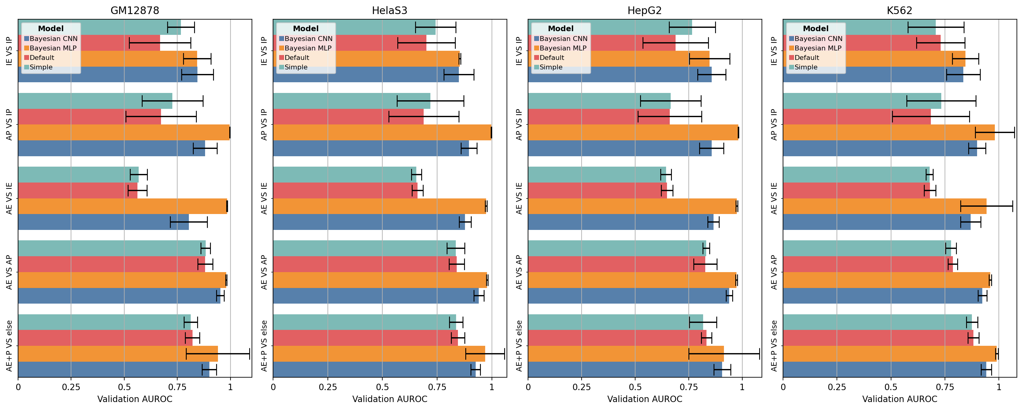
In the following example we will plot the bars horizontally, rotating the group labels by 90 degrees and displaying the bar labels as a shared legend.
from barplots import barplots

barplots(
    df,
    groupby=["task","model"],
    orientation="horizontal",
    show_legend=True,
    minor_rotation=90,
    custom_defaults=custom_defaults
)
Result can be seen here.
Horizontal Example B
In the following example we will plot the top index as multiple subplots with horizontal bars, rotating the group labels by 90 degrees and displaying the bar labels as a shared legend.
from barplots import barplots

barplots(
    df,
    groupby=["cell_line", "task","model"],
    orientation="horizontal",
    show_legend=True,
    subplots=True,
    minor_rotation=90,
    custom_defaults=custom_defaults
)
Horizontal Example C
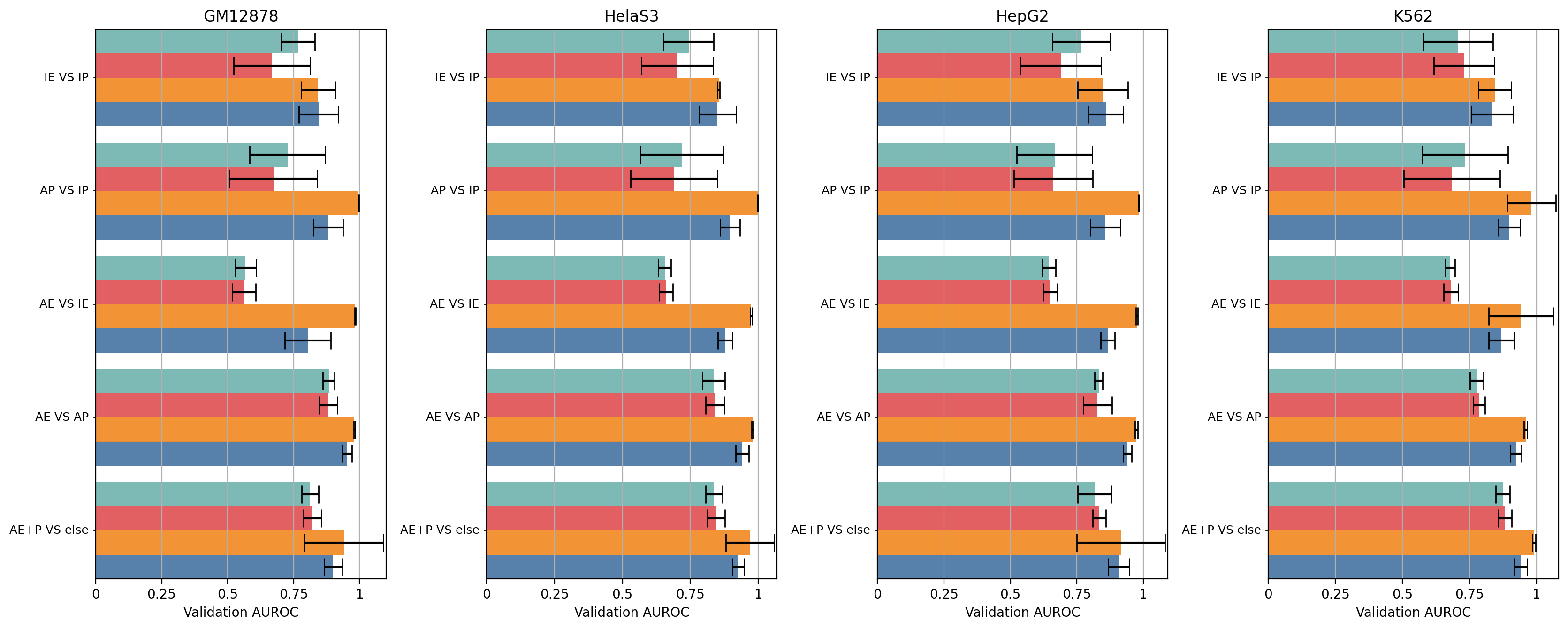
In the following example we will plot horizontal bars, rotating the top group labels by 90 degrees and displaying the bar labels as minor ticks.
from barplots import barplots

barplots(
    df,
    groupby=["task","model"],
    orientation="horizontal",
    show_legend=False,
    major_rotation=90,
    custom_defaults=custom_defaults
)
Result can be seen here
Horizontal Example D
In the following example we will plot the top index as multiple subplots with horizontal bars, rotating the group labels by 90 degrees and displaying the bar labels as minor ticks.
from barplots import barplots

barplots(
    df,
    groupby=["cell_line", "task","model"],
    orientation="horizontal",
    show_legend=False,
    major_rotation=90,
    subplots=True,
    custom_defaults=custom_defaults
)
Vertical Example A
In the following example we will plot the bars vertically and displaying the bar labels as a shared legend.
from barplots import barplots

barplots(
    df,
    groupby=["task","model"],
    orientation="vertical",
    show_legend=True,
    custom_defaults=custom_defaults
)
Result can be seen here
Vertical Example B
In the following example we will plot the top index as multiple subplots with vertical bars and displaying the bar labels as a shared legend.
from barplots import barplots

barplots(
    df,
    groupby=["cell_line", "task","model"],
    orientation="vertical",
    show_legend=True,
    subplots=True,
    custom_defaults=custom_defaults
)
Vertical Example C
In the following example we will plot vertical bars, rotating the minor group labels by 90 degrees and displaying the bar labels as minor ticks.
from barplots import barplots

barplots(
    df,
    groupby=["task","model"],
    orientation="vertical",
    show_legend=False,
    minor_rotation=90,
    custom_defaults=custom_defaults
)
Result can be seen here
Vertical Example D
In the following example we will plot the top index as multiple subplots with vertical bars, rotating the minor group labels by 90 degrees and displaying the bar labels as minor ticks.
from barplots import barplots

barplots(
    df,
    groupby=["cell_line", "task","model"],
    orientation="vertical",
    show_legend=False,
    minor_rotation=90,
    subplots=True,
    custom_defaults=custom_defaults
)
Future features
Currently it is not possible to automatically detect labels overlap and rotate them.
I will work on this feature when I get the time, currently you will need to use the parameters minor_rotation and major_rotation.
Project details
Release history Release notifications | RSS feed
Download files
Download the file for your platform. If you're not sure which to choose, learn more about installing packages.


