A collection of Plotly figure templates with a Bootstrap theme
Project description
Dash Bootstrap Templates
See these features live at : https://hellodash.pythonanywhere.com/theme_explorer
dash-bootstrap-templates library provides:
-
52 Bootstrap themed Plotly figure templates
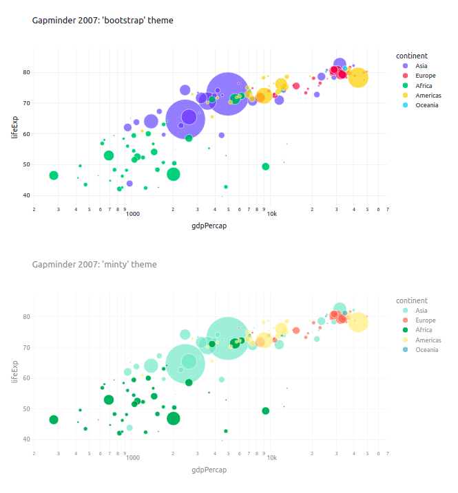
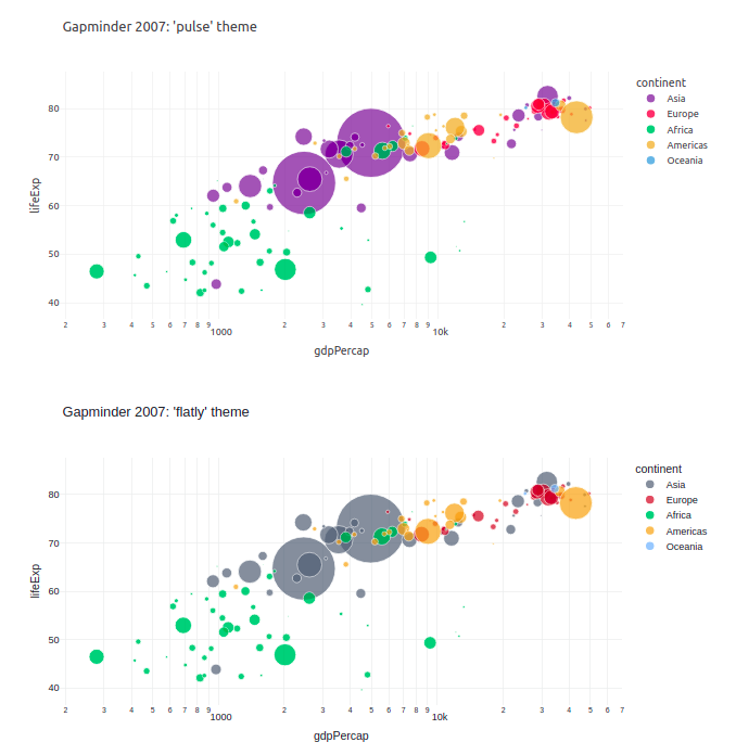
- You will find a Plotly template for each of the 26 Bootstrap/Bootswatch themes available in the Dash Bootstrap Components Library. These templates will automatically style your figures with Bootstrap theme colors and fonts.
- As of V1.1 a dark mode is available for each theme. This is ideal for use with the Bootstrap Color Modes available as of Bootstrap 5.3.0
-
Two All-in-One components to change themes in a Dash app.
ThemeSwitchAIOtoggles between two themes.ThemeChangerAIOselect from multiple themes.
-
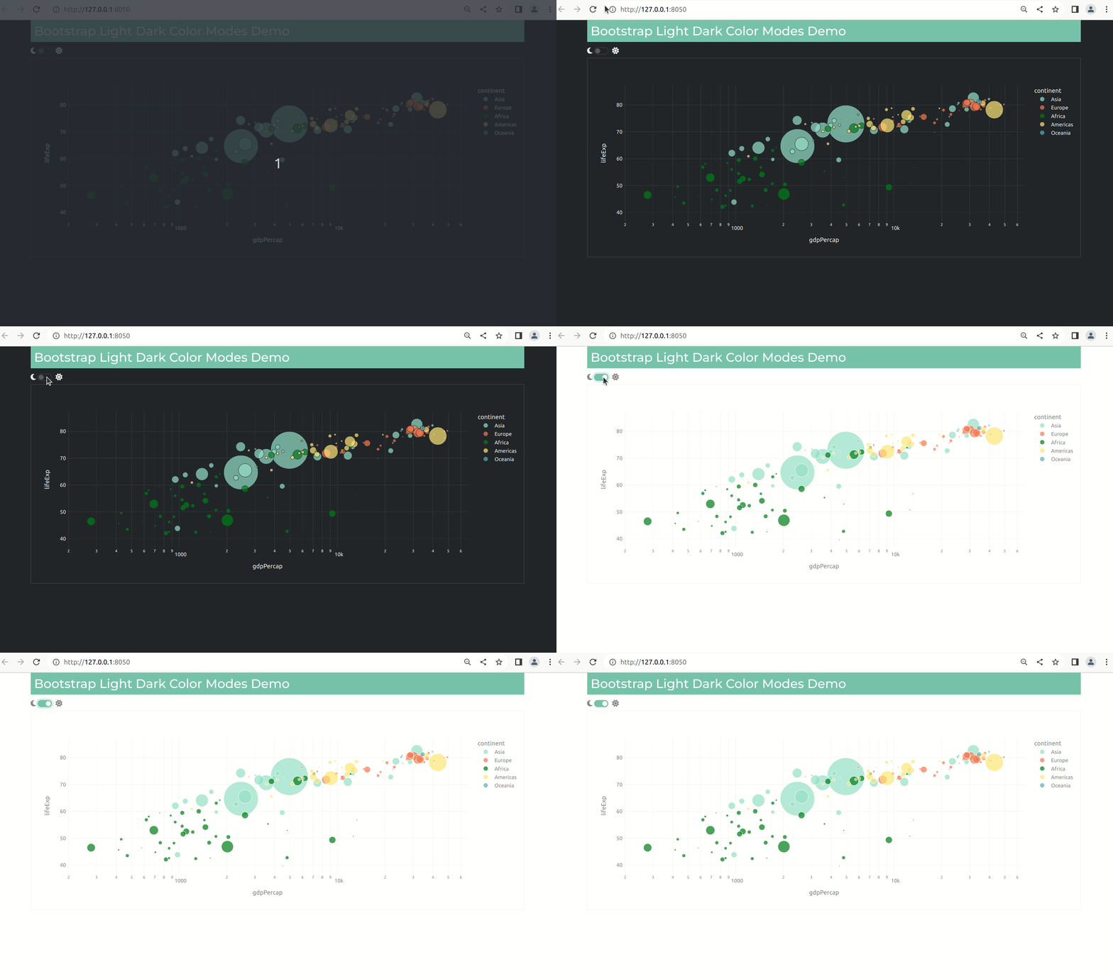
Examples of a Color Mode Switch to toggle between a light and dark theme.
-
The dbc.css stylesheet which styles Dash AG Grid, Dash Core Components and the Dash DataTable with a Bootstrap theme.
Usage Notes:
The
ThemeChangerAIOcomponent and thedbc.cssstylesheet requires Dash Bootstrap Components>=V1.0.0. It will only work with the themes included in Dash Bootstrap Components>=V1.0.0.As of V1.0.8, the themes in the
ThemeSwitchAIOcomponent can be specified as a pathname or a URL. This allows for working off-line and with custom stylesheets.The Bootstrap themed Plotly figure templates can be used with any Plotly figure. It does not require Dash or the Dash Bootstrap Components library.
Figure Template Quickstart
pip install dash-bootstrap-templates
Learn more about Plotly figure templates and themes at: https://plotly.com/python/templates/
"""
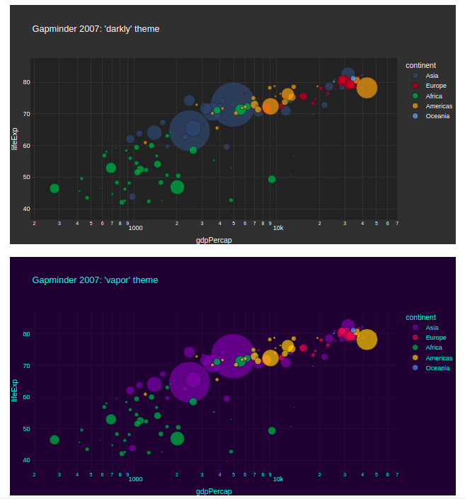
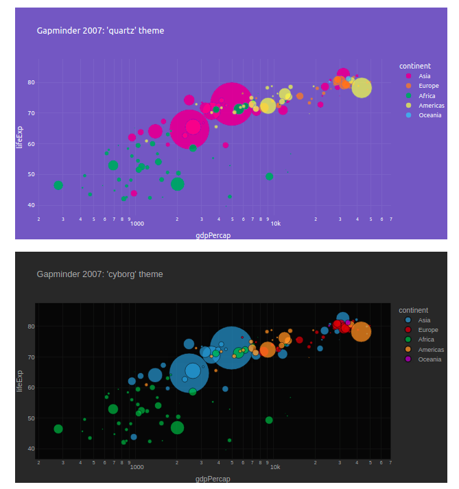
A sample of 8 of the 26 Bootstrap themed Plotly figure templates available
in the dash-bootstrap-template library

"""
from dash import Dash, html, dcc
import dash_bootstrap_components as dbc
from dash_bootstrap_templates import load_figure_template
import plotly.express as px

df = px.data.gapminder()

templates = [
    "bootstrap",
    "minty",
    "pulse",
    "flatly",
    "quartz",
    "cyborg",
    "darkly",
    "vapor",
]

load_figure_template(templates)

figures = [
    px.scatter(
        df.query("year==2007"),
        x="gdpPercap",
        y="lifeExp",
        size="pop",
        color="continent",
        log_x=True,
        size_max=60,
        template=template,
        title="Gapminder 2007: '%s' theme" % template,
    )
    for template in templates
]

app = Dash(__name__, external_stylesheets=[dbc.themes.BOOTSTRAP])

app.layout = dbc.Container([dcc.Graph(figure=fig, className="m-4") for fig in figures])

if __name__ == "__main__":
    app.run_server(debug=True)
dbc.css stylesheet
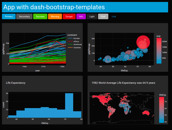
The dash-ag-grid, dash-core-components, the Dash DataTable and Plotly figures are not automatically styled with a Bootstrap theme.
An easy way to make your Dash components look better with a Bootstrap theme is to use the stylesheet from
the dash-bootstrap-templates library. This stylesheet defines the "dbc" class.
Adding className="dbc dbc-ag-grid" minimally styles Dash components with your selected Bootstrap theme:
- Makes the text readable in both light and dark themes.
- Uses theme's font-family.
- Changes the accent color to the theme's primary color
You can add the dbc class as an external stylesheet like this:
dbc_css = ("https://cdn.jsdelivr.net/gh/AnnMarieW/dash-bootstrap-templates@V1.0.2/dbc.min.css")
app = dash.Dash(__name__, external_stylesheets=[dbc.themes.BOOTSTRAP, dbc_css])
Add className="dbc dbc-ag-grid" to the outer container of the app or a component like this:
app.layout = dbc.Container(
    [
        ...
    ],
    fluid=True,
    className="dbc dbc-ag-grid"
)
That's it! Simply adding className="dbc dbc-ag-grid" will make Dash AG Grid, Dash Core Components and the DataTable look better with ALL themes included in the dash-bootstrap-components library.
See a live demo at: https://hellodash.pythonanywhere.com/adding-themes/dcc-components
If you have suggestion for improvements or if you find a bug, please let us know on the issue tracker
Requires dash-bootstrap-components>=V1.0.0
Theme Switcher Components
See a live demo at https://hellodash.pythonanywhere.com/theme_change_components
dash-bootstrap-templates has two All-in-One components to change themes.
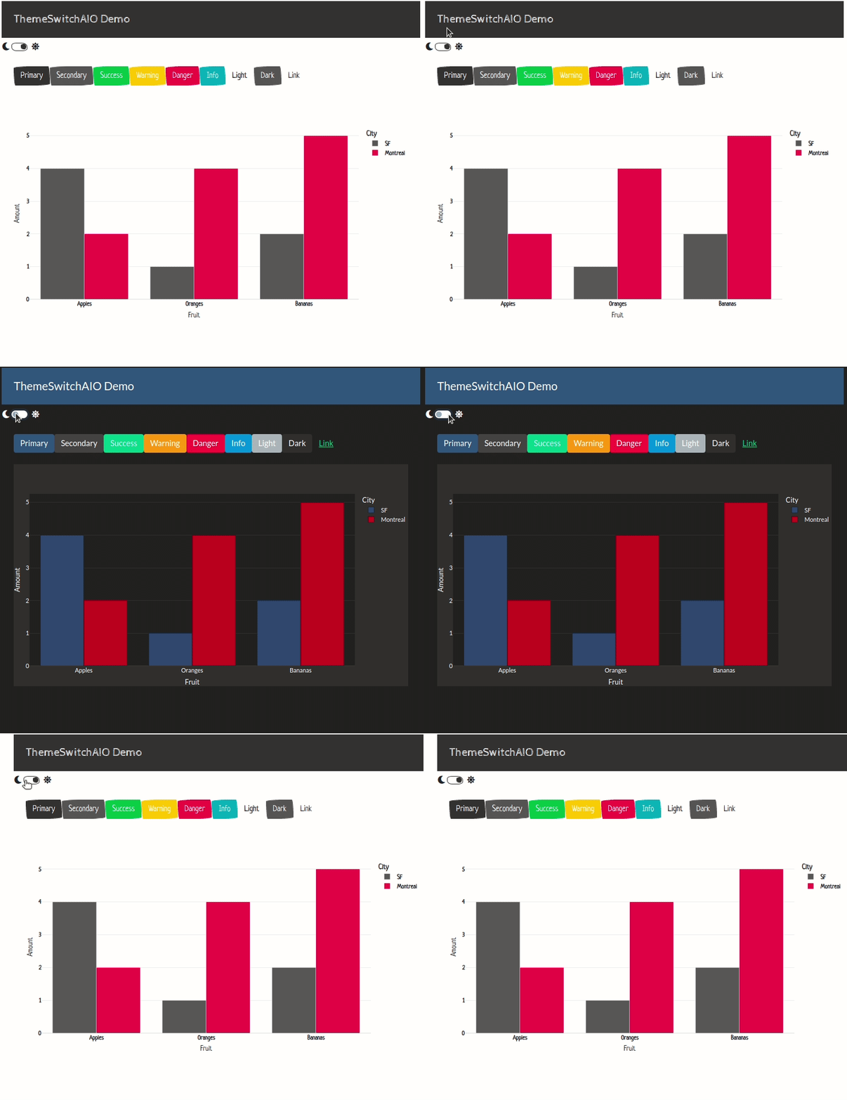
The ThemeSwitchAIO is a switch with icons on the left and right, which is ideal for toggling between a light and a dark theme.
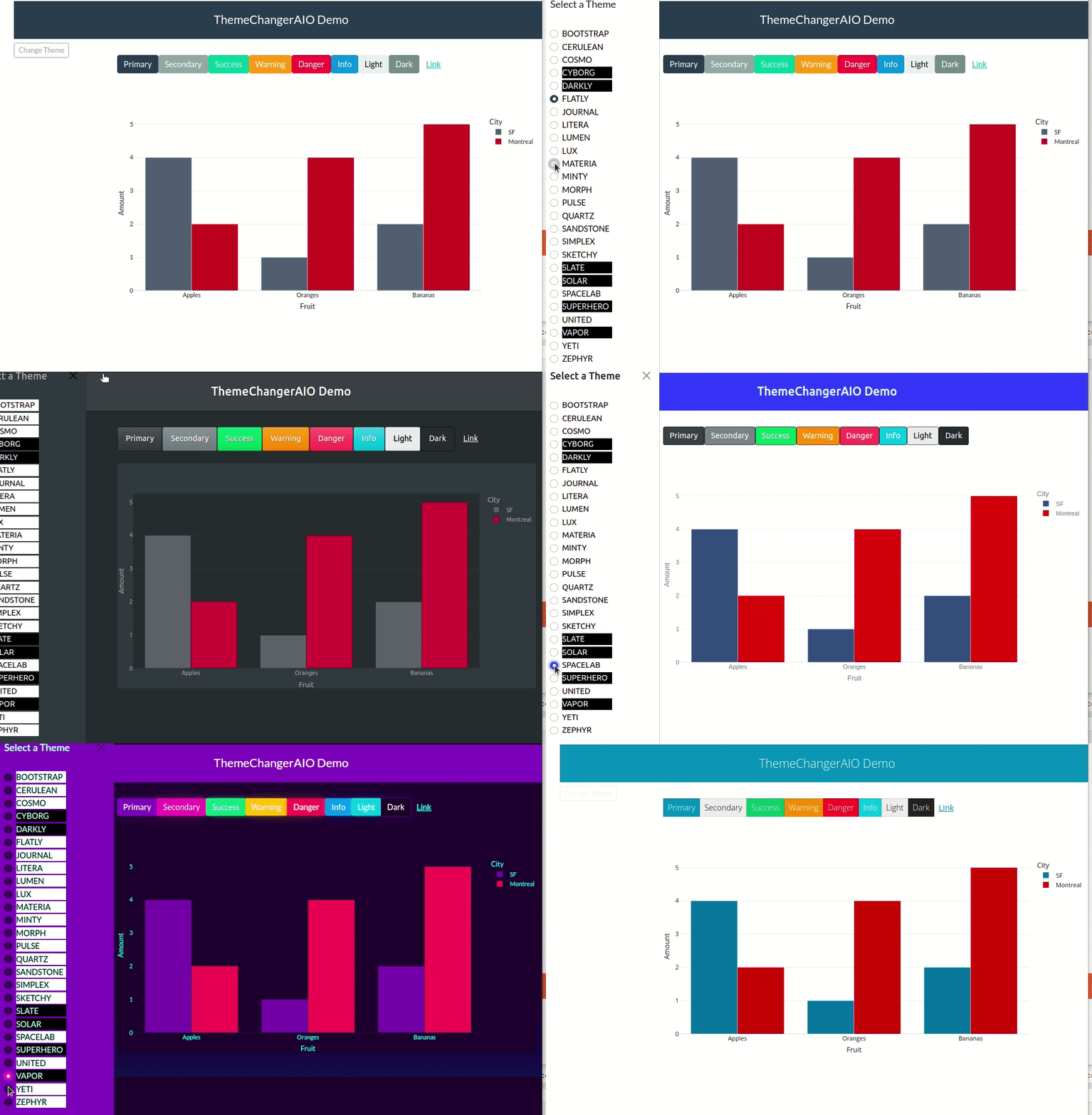
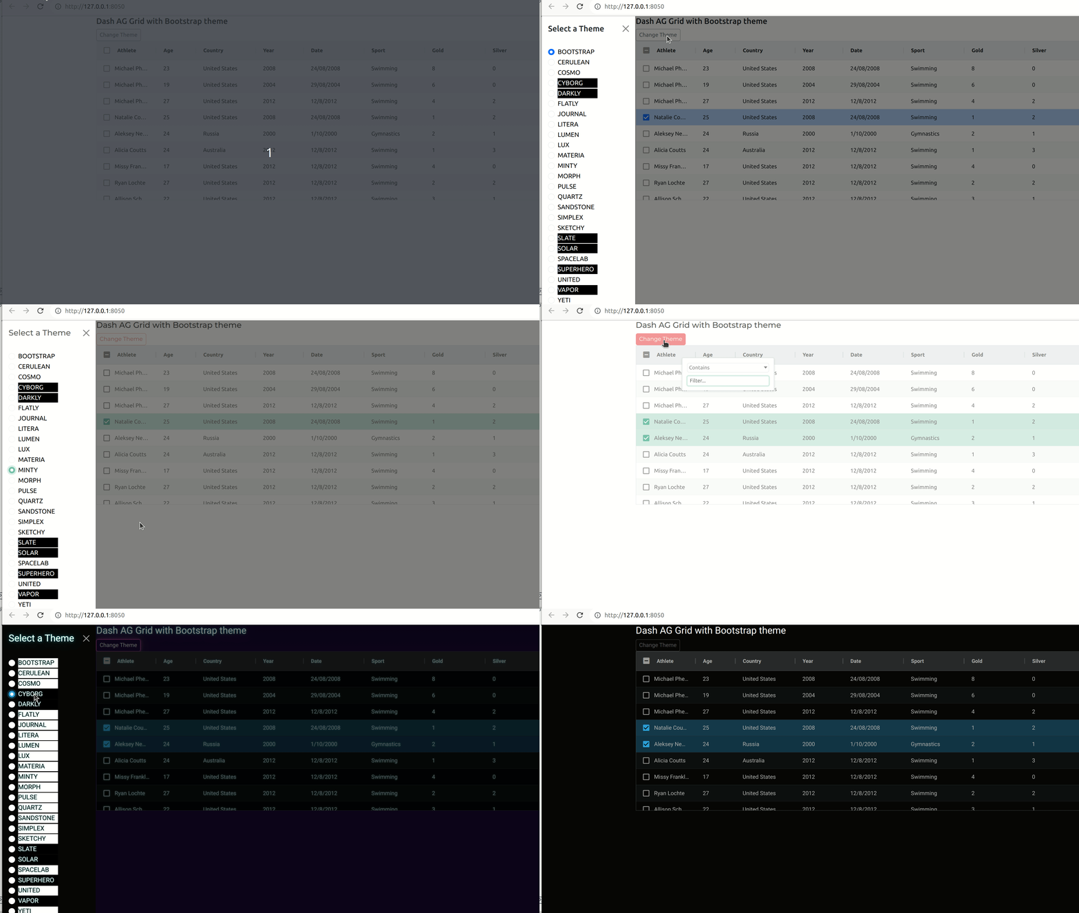
The ThemeChangerAIO has a button that opens an dbc.Offcanvas component which by default shows all the available themes.
Note the All-in-One component switches the Bootstrap stylesheet for the app and sets the default Plotly figure template
for the theme, however, figures must be updated in a callback in order to render the figure with the new template.
See the callback below for an example. The template_from_url is a helper function that returns the template name
based on the theme url. For example template_from_ur(dbc.themes.SLATE) returns "slate"
ThemeChangerAIO Quickstart
from dash import Dash, dcc, html, Input, Output
import pandas as pd
import plotly.express as px
import dash_bootstrap_components as dbc
from dash_bootstrap_templates import ThemeChangerAIO, template_from_url


dbc_css = (
    "https://cdn.jsdelivr.net/gh/AnnMarieW/dash-bootstrap-templates@V1.0.1/dbc.min.css"
)
app = Dash(__name__, external_stylesheets=[dbc.themes.BOOTSTRAP, dbc_css])


df = pd.DataFrame(
    {
        "Fruit": ["Apples", "Oranges", "Bananas", "Apples", "Oranges", "Bananas"],
        "Amount": [4, 1, 2, 2, 4, 5],
        "City": ["SF", "SF", "SF", "Montreal", "Montreal", "Montreal"],
    }
)
header = html.H4(
    "ThemeChangerAIO Demo", className="bg-primary text-white p-4 mb-2 text-center"
)
buttons = html.Div(
    [
        dbc.Button("Primary", color="primary"),
        dbc.Button("Secondary", color="secondary"),
        dbc.Button("Success", color="success"),
        dbc.Button("Warning", color="warning"),
        dbc.Button("Danger", color="danger"),
        dbc.Button("Info", color="info"),
        dbc.Button("Light", color="light"),
        dbc.Button("Dark", color="dark"),
        dbc.Button("Link", color="link"),
    ],
    className="m-4",
)
graph = html.Div(dcc.Graph(id="graph"), className="m-4")

app.layout = dbc.Container(
    [
        header,
        dbc.Row(
            [
                dbc.Col(ThemeChangerAIO(aio_id="theme", radio_props={"value":dbc.themes.FLATLY}), width=2,),
                dbc.Col([buttons, graph],width=10),
            ]
        ),
    ],
    className="m-4 dbc",
    fluid=True,
)


@app.callback(
    Output("graph", "figure"), Input(ThemeChangerAIO.ids.radio("theme"), "value"),
)
def update_graph_theme(theme):
    return px.bar(
        df, x="Fruit", y="Amount", color="City", barmode="group", template=template_from_url(theme)
    )


if __name__ == "__main__":
    app.run_server(debug=True)
Here is the same app, but using a the ThemeSwitchAIO component to toggle between two themes.
See the (code here).
It's also possible to change the icons. See an example of using Bootstrap icons instead of the default FontAwesome icons here.
Color Mode Switch
Requires dash-bootstrap-components>=1.5.0
This is the recommended way to switch between a light and a dark mode using Bootstrap Color modes available in Bootstrap 5.3.0.
from dash import Dash, html, dcc, Input, Output, clientside_callback, callback
import plotly.express as px
import dash_bootstrap_components as dbc

from dash_bootstrap_templates import load_figure_template
load_figure_template(["minty", "minty_dark"])


df = px.data.gapminder()

app = Dash(__name__, external_stylesheets=[dbc.themes.MINTY, dbc.icons.FONT_AWESOME])

color_mode_switch =  html.Span(
    [
        dbc.Label(className="fa fa-moon", html_for="switch"),
        dbc.Switch( id="switch", value=False, className="d-inline-block ms-1", persistence=True),
        dbc.Label(className="fa fa-sun", html_for="switch"),
    ]
)

app.layout = dbc.Container(
    [
        html.Div(["Bootstrap Light Dark Color Modes Demo"], className="bg-primary text-white h3 p-2"),
        color_mode_switch,
        dcc.Graph(id="graph", className="border"),
    ]

)

@callback(
    Output("graph", "figure"),
    Input("switch", "value"),
)
def update_figure_template(switch_on):
    template = "minty" if switch_on else "minty_dark"
    fig = px.scatter(
        df.query("year==2007"),
        x="gdpPercap",
        y="lifeExp",
        size="pop",
        color="continent",
        log_x=True,
        size_max=60,
        template=template,
    )
    return fig


clientside_callback(
    """
    (switchOn) => {
       switchOn
         ? document.documentElement.setAttribute('data-bs-theme', 'light')
         : document.documentElement.setAttribute('data-bs-theme', 'dark')
       return window.dash_clientside.no_update
    }
    """,
    Output("switch", "id"),
    Input("switch", "value"),
)


if __name__ == "__main__":
    app.run_server(debug=True)
Dash AG Grid with a Bootstrap theme
Here is an example of the theme change component to show different Bootstrap themes with Dash AG Grid:
See live demo https://hellodash.pythonanywhere.com/adding-themes/ag-grid
Background
Dash Labs is Plotly library that explores new features for future releases of Dash. In Dash Labs V0.4.0, there was a cool feature where Bootstrap themed figure templates were created "on the fly". This was a part of the layout templates project that is no longer being developed.
Even though these Bootstrap themed figure templates will not be included in Dash, the dash-bootstrap-templates makes
them available to you. The figure templates are created using the Dash Labs' algorithms and saved in json format. When
you use load_figure_template() in your app, it loads the json file, adds it to plotly.io and sets it as the default figure template for an app. See more
information about Plotly figure templates here.
Available Themes
This library provides a figure template for the following Bootstrap/Bootswatch themes:
templates = [ "bootstrap", "cerulean", "cosmo", "cyborg", "darkly", "flatly", "journal", "litera", "lumen", "lux", "materia", "minty", "morph", "pulse", "quartz", "sandstone", "simplex", "sketchy", "slate", "solar", "spacelab", "superhero", "united", "vapor", "yeti", "zephyr" ]
templates_dark = ['bootstrap_dark', 'cerulean_dark', 'cosmo_dark', 'cyborg_dark', 'darkly_dark', 'flatly_dark', 'journal_dark', 'litera_dark', 'lumen_dark', 'lux_dark', 'materia_dark', 'minty_dark', 'morph_dark', 'pulse_dark', 'quartz_dark', 'sandstone_dark', 'simplex_dark', 'sketchy_dark', 'slate_dark', 'solar_dark', 'spacelab_dark', 'superhero_dark', 'united_dark', 'vapor_dark', 'yeti_dark', 'zephyr_dark']
Note in dark themes ["cyborg", "darkly", "slate", "solar", "superhero", "vapor"], there is not much difference in the figure templates in light or dark color modes.
ThemeChangerAIO Reference
ThemeChangerAIO is an All-in-One component composed of a parent html.Div with
the following components as children:
dbc.Button("switch") Opens the Offcanvas component for user to select a theme.dbc.Offcanvas("offcanvas")dbc.RadioItems("radio"). The themes are displayed as RadioItems inside thedbc.Offcanvascomponent. Thevalueis a url for the themehtml.Divis used as theOutputof the clientside callbacks.
The ThemeChangerAIO component updates the stylesheet when the value of radio changes. (ie the user selects a new theme)
- param:
radio_propsA dictionary of properties passed into the dbc.RadioItems component. The defaultvalueisdbc.themes.BOOTSTRAP - param:
button_propsA dictionary of properties passed into the dbc.Button component. - param:
offcanvas_props. A dictionary of properties passed into the dbc.Offcanvas component - param:
aio_idThe All-in-One component ID used to generate components' dictionary IDs.
The All-in-One component dictionary IDs are available as:
- ThemeChangerAIO.ids.radio(aio_id)
- ThemeChangerAIO.ids.offcanvas(aio_id)
- ThemeChangerAIO.ids.button(aio_id)
ThemeSwitchAIO Reference
ThemeSwitchAIO is an All-in-One component composed of a parent html.Div with the following components as children:
dbc.Switch("switch") with icons to the left and right of the switch.dcc.Store("store") Thethemesare stored in thedataprop.html.Divis used as theOutputof the clientside callbacks.
The ThemeSwitchAIO component updates the stylesheet when triggered by changes to the value of switch or when
the themes are updated in the "store" component. The themes in the switch may be updated in a callback
by changing the theme urls in the "store" component.
- param:
switch_propsA dictionary of properties passed into the dbc.Switch component. - param:
themesA list of two urls for the external stylesheets or pathnames to files. - param:
iconsA dict of the icons to the left and right of the switch. The default is
{"left" :"fa fa-moon", "right" :"fa fa-sun"}. - param:
aio_idThe All-in-One component ID used to generate component's dictionary IDs.
The All-in-One component dictionary IDs are available as
- ThemeSwitchAIO.ids.switch(aio_id)
- ThemeSwitchAIO.ids.store(aio_id)
Contributors
Special thanks to @tcbegley and @emilhe for their help with this project.
Project details
Release history Release notifications | RSS feed
Download files
Download the file for your platform. If you're not sure which to choose, learn more about installing packages.
Source Distribution
Built Distribution
File details
Details for the file dash_bootstrap_templates-1.2.1.tar.gz.
File metadata
- Download URL: dash_bootstrap_templates-1.2.1.tar.gz
- Upload date:
- Size: 110.6 kB
- Tags: Source
- Uploaded using Trusted Publishing? No
- Uploaded via: twine/5.1.1 CPython/3.9.19
File hashes
| Algorithm | Hash digest | |
|---|---|---|
| SHA256 | a8bd8ec9c9b223a7ccefbb30398630d3f078b9abb357e5cb68c04900a2786f5a |
|
| MD5 | e0b8eed75ee543e4bf5200368c09a501 |
|
| BLAKE2b-256 | 232f20e3c98b8bb8f70947d0e6149263e4a4d25de1492bbb305af17020293a74 |
File details
Details for the file dash_bootstrap_templates-1.2.1-py3-none-any.whl.
File metadata
- Download URL: dash_bootstrap_templates-1.2.1-py3-none-any.whl
- Upload date:
- Size: 97.2 kB
- Tags: Python 3
- Uploaded using Trusted Publishing? No
- Uploaded via: twine/5.1.1 CPython/3.9.19
File hashes
| Algorithm | Hash digest | |
|---|---|---|
| SHA256 | a5e9ad1b51fcfff6b6ea7cbe5ad59d1b444f389e2d2f63a3aba1a15c889e65f6 |
|
| MD5 | e95f2365fb5ba9f614288fc1911470ba |
|
| BLAKE2b-256 | ccc81d8c56d941c034d7c34c75928ef40db1b1c38e9e41652f967ae0ea55a169 |


